Designing a publishing platform that keeps every moving part in sync.
The brief
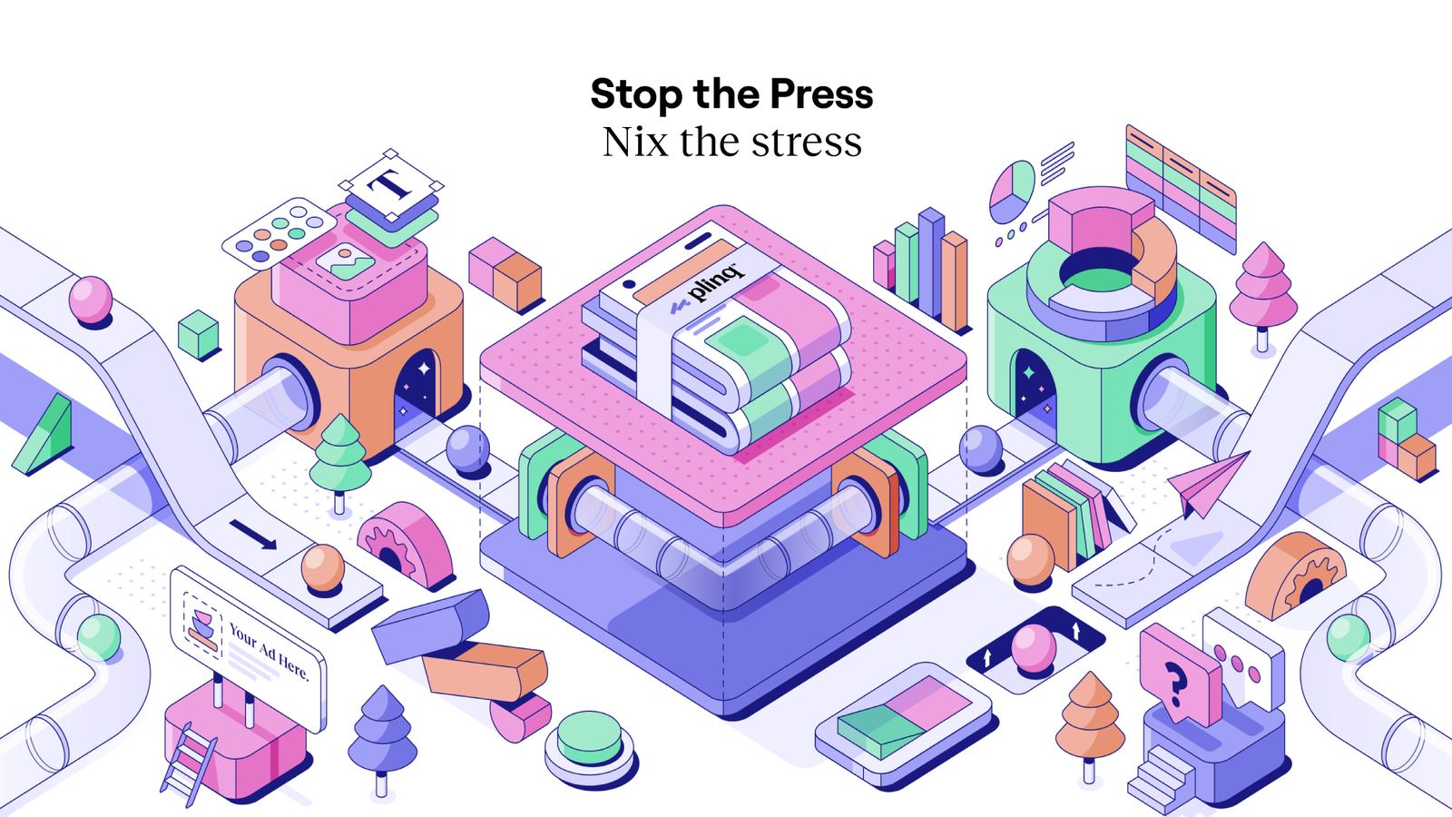
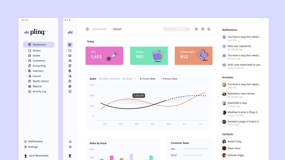
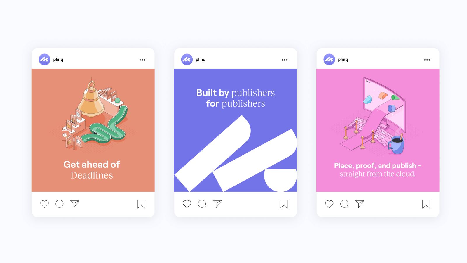
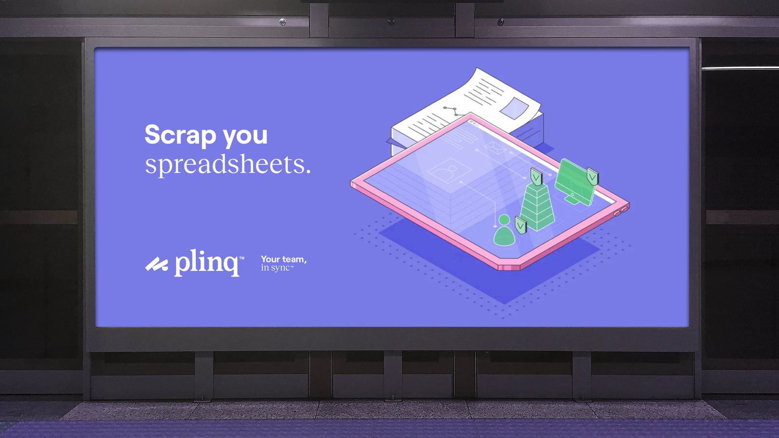
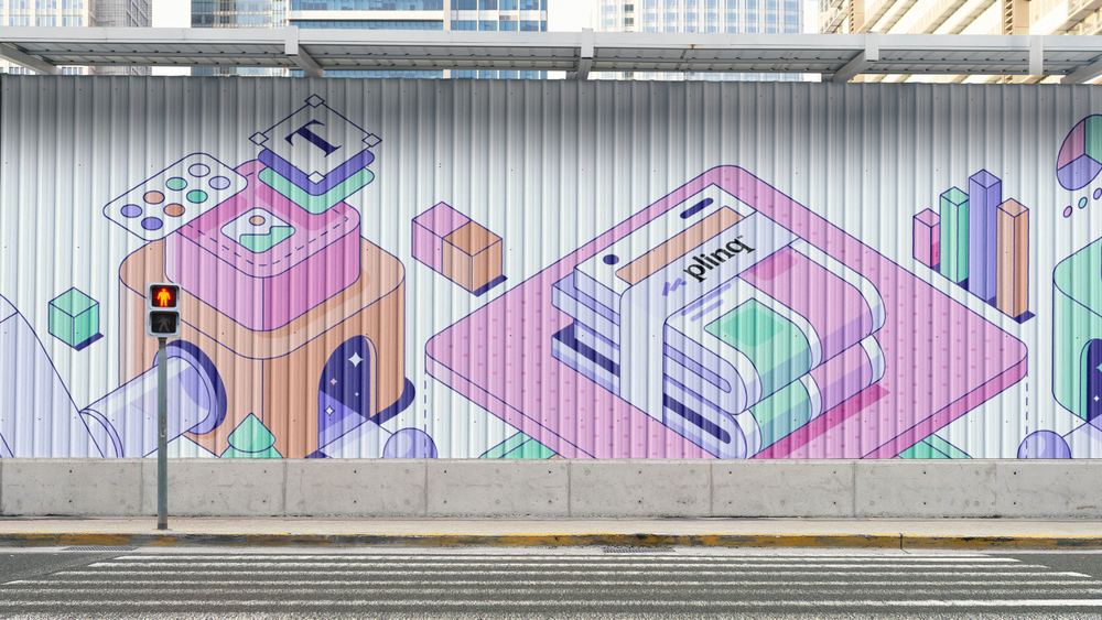
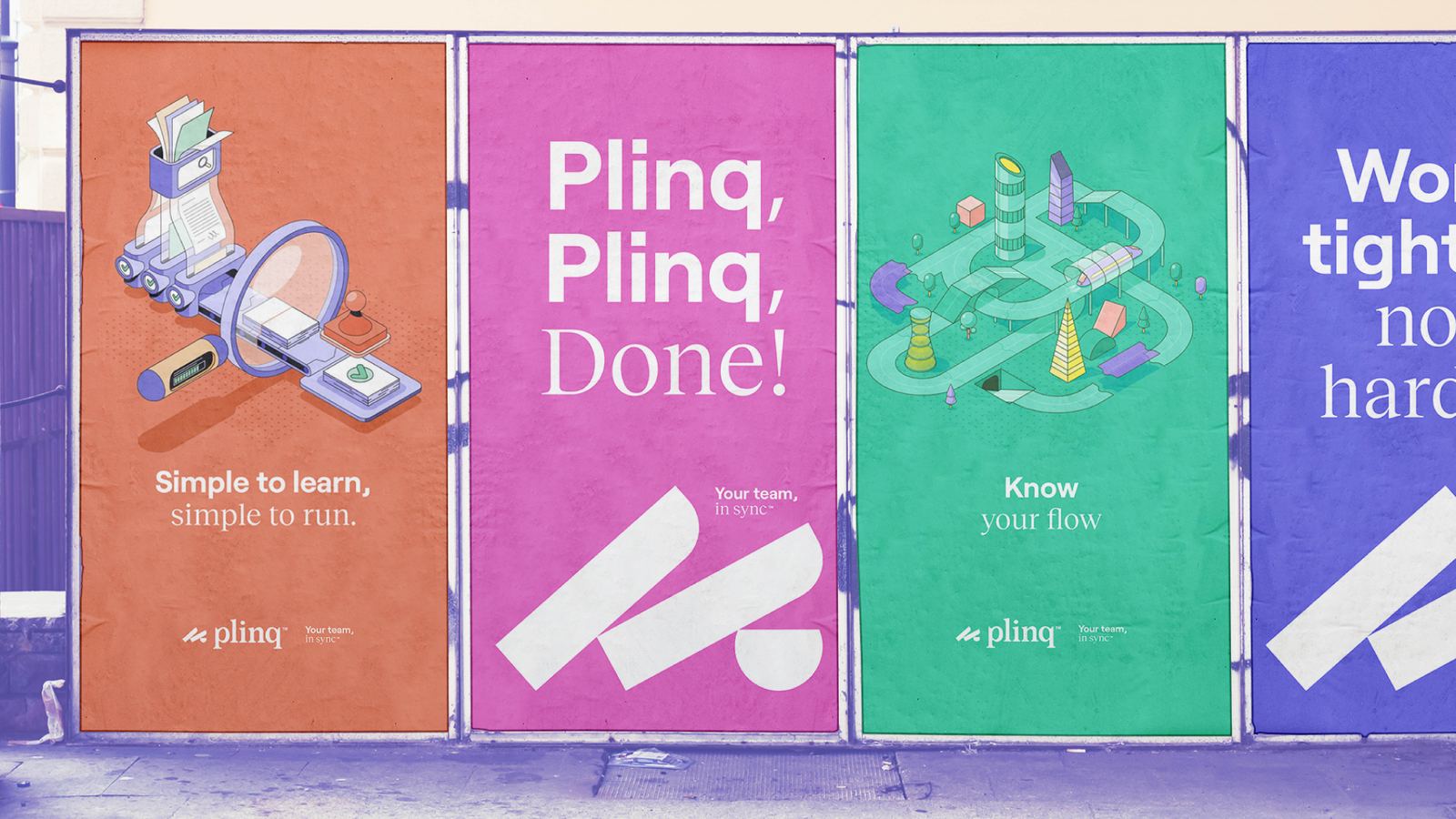
Built for publishers, Plinq brings every stage of the publishing workflow into one connected platform. The identity reflects that same philosophy, transforming a complex process into a visual system that feels organized, intuitive, and effortless.

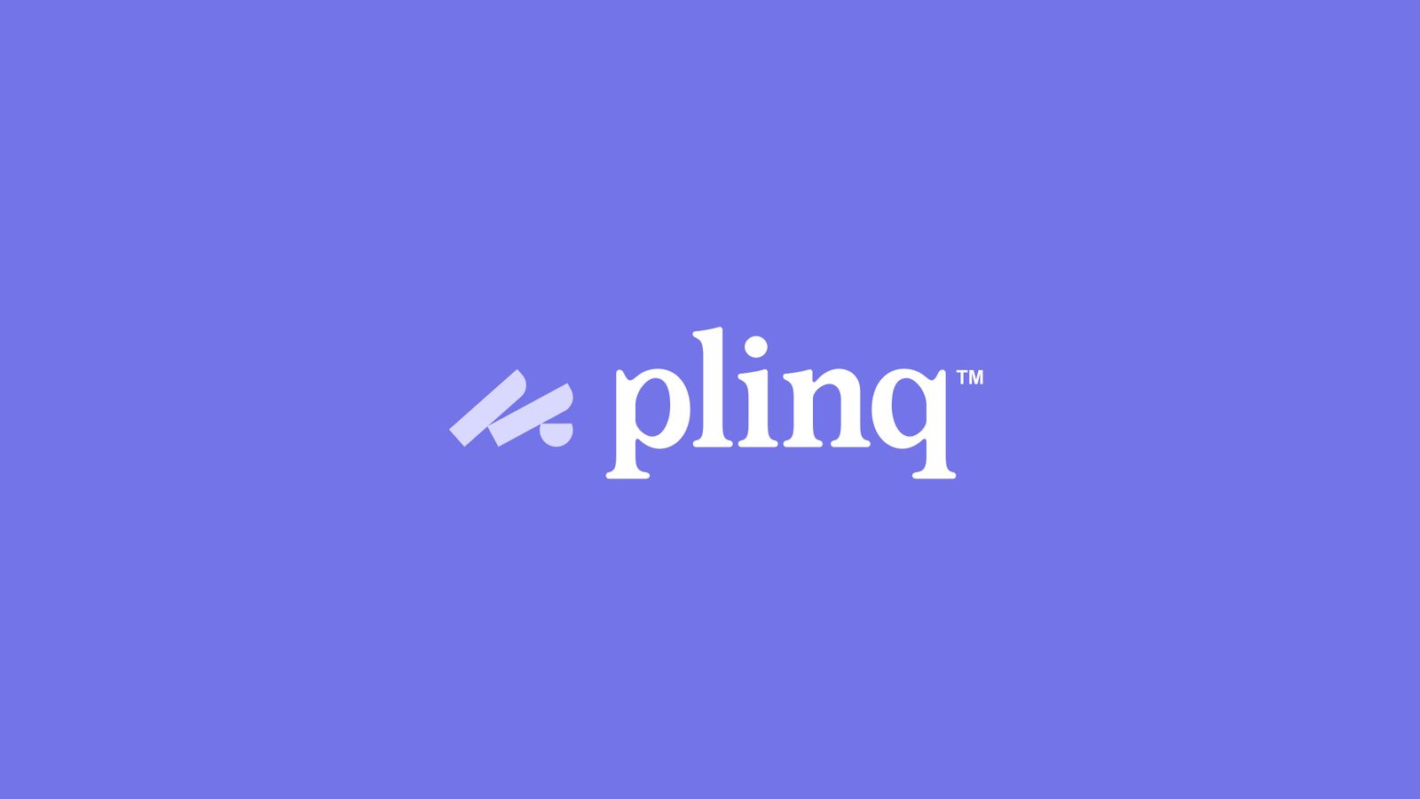
Behind the mark
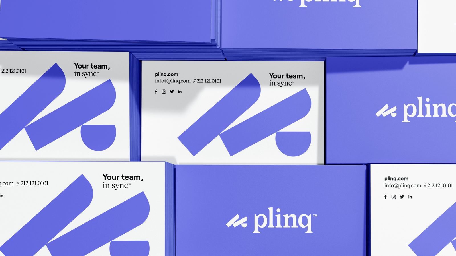
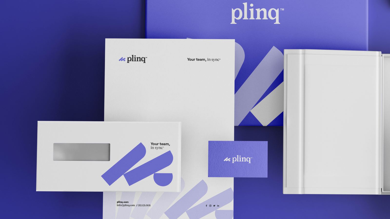
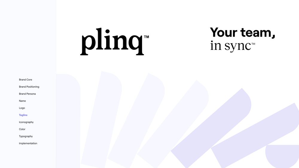
The custom P is constructed from a series of domino-like forms that represent the many people, tasks, and moving pieces behind every publication. Together, they form a single mark that reflects Plinq's ability to connect an entire publishing operation through one seamless platform.


Color palette 1
Next projects