Creating a visual identity for care that feels deeply human.
The brief
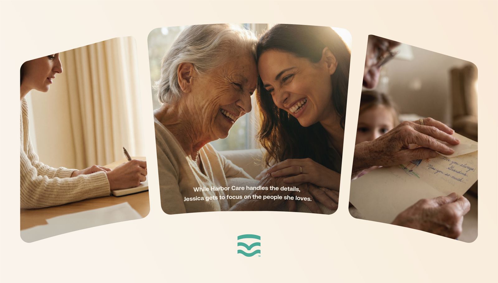
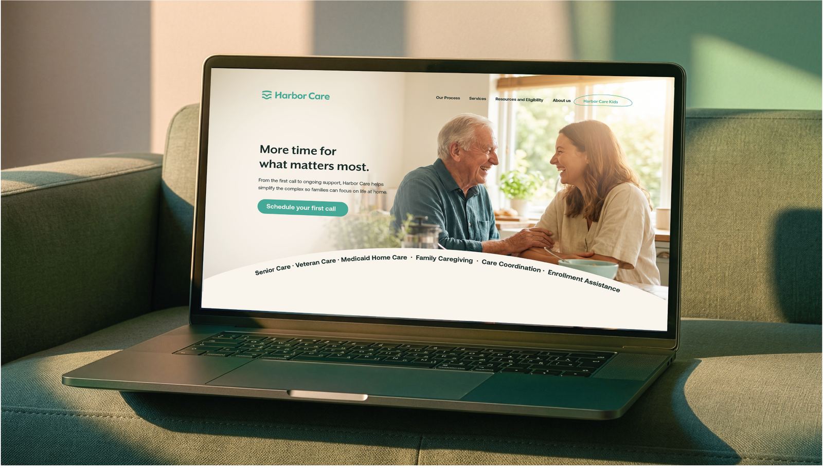
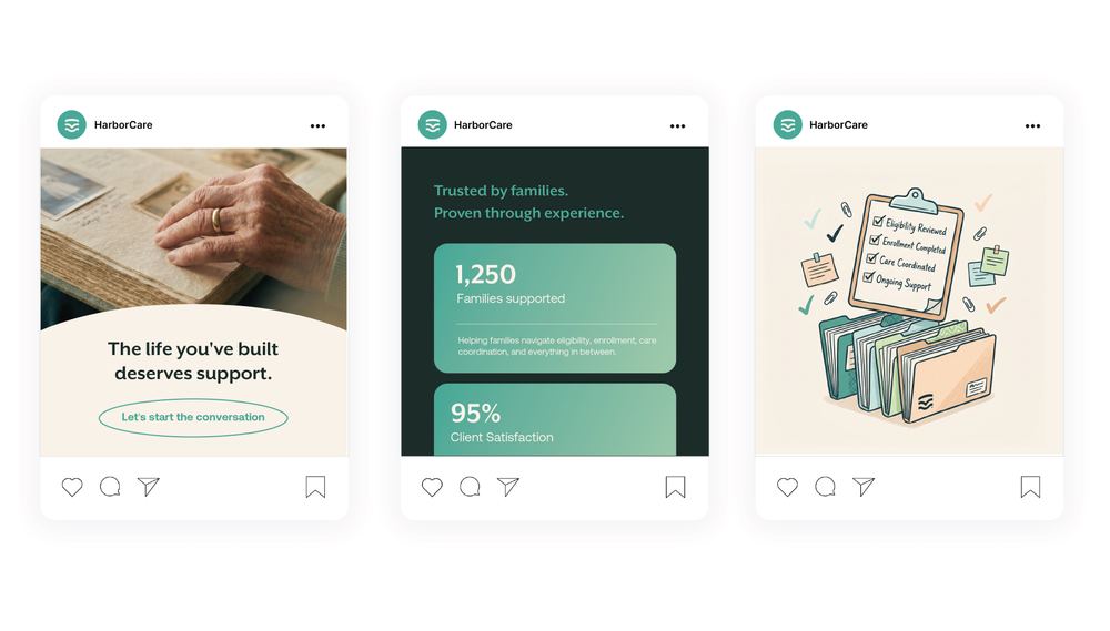
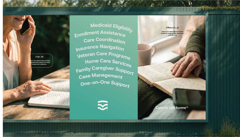
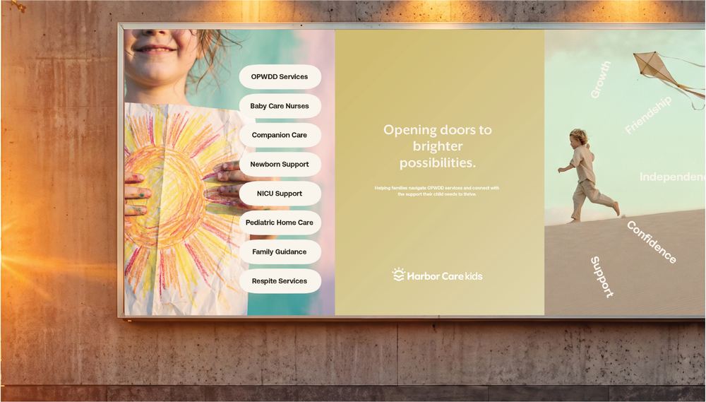
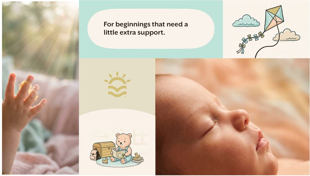
Harbor Care needed an identity that reflected the experience they provide: guidance, reassurance, and compassionate support. The goal was to create a brand that felt trustworthy and professional while remaining warm, approachable, and deeply human.


Behind the mark
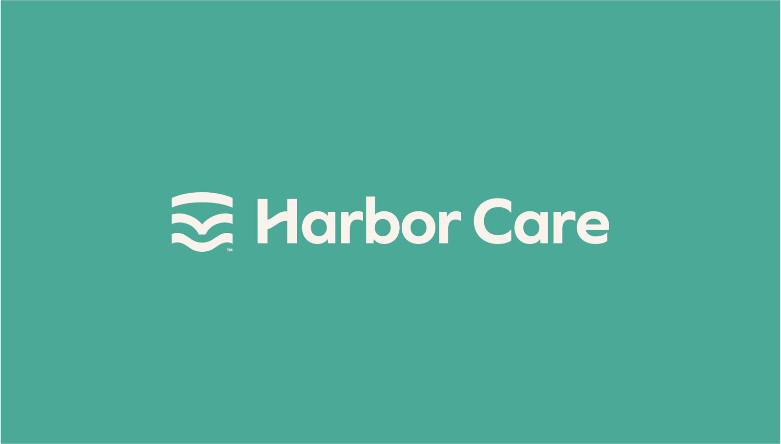
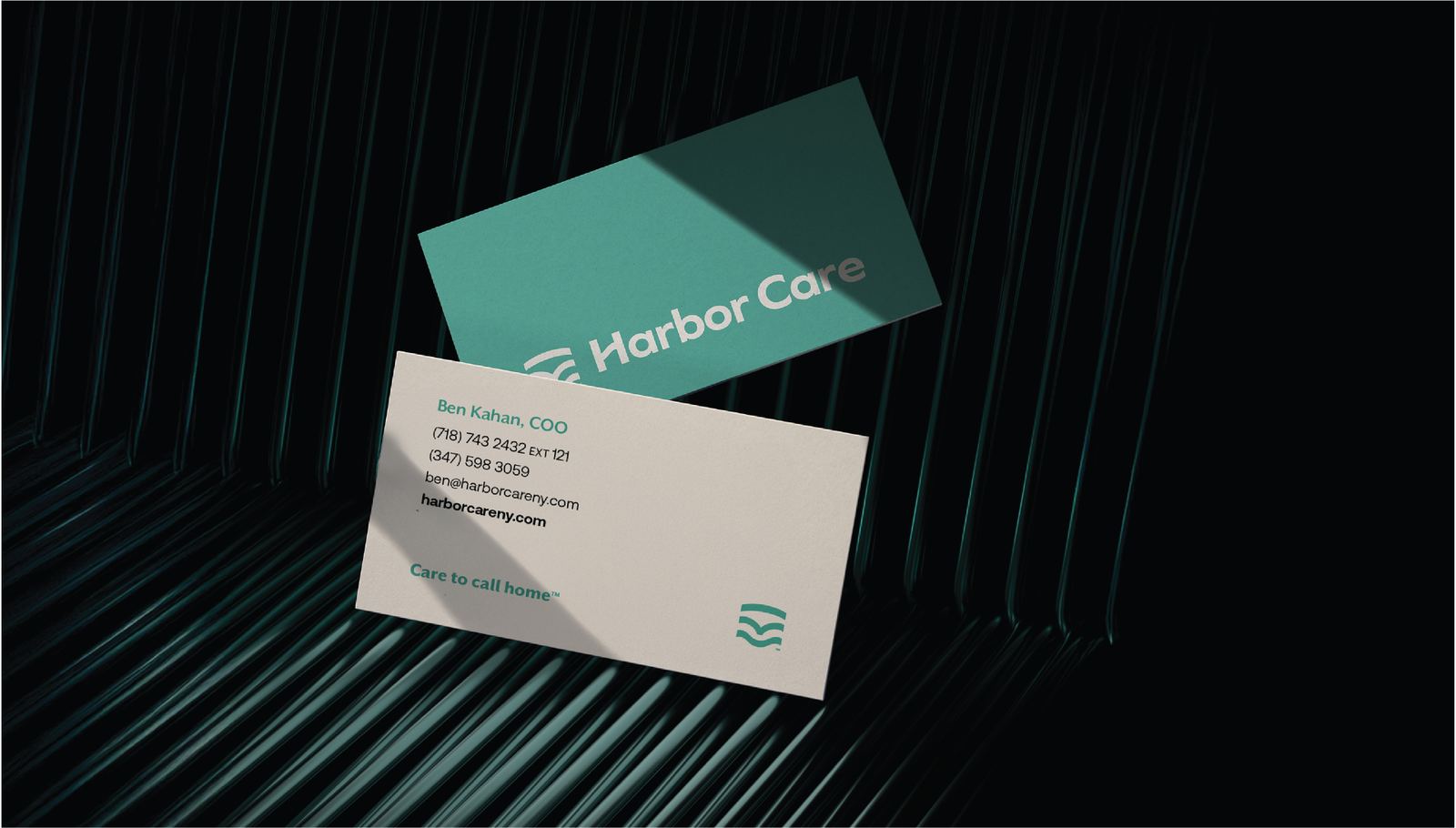
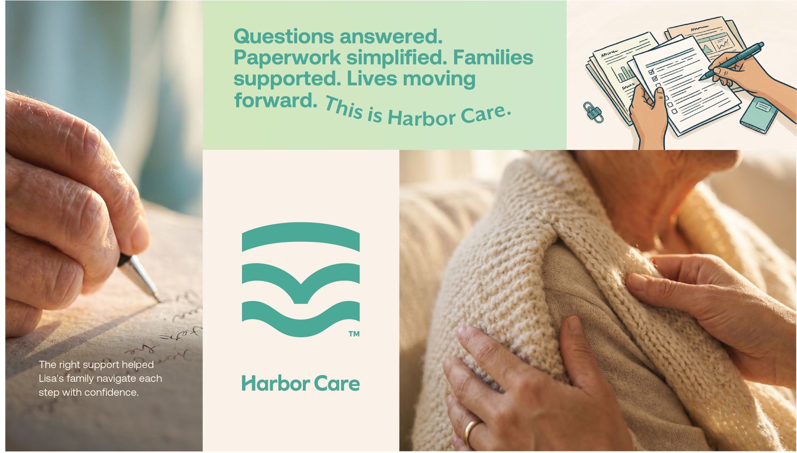
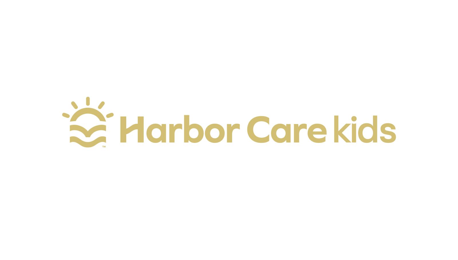
Inspired by the idea of a safe harbor, the mark combines an arch, a subtle heart, and a flowing wave into a single symbol. Together, these elements represent protection, human connection, and forward movement, creating an identity that feels supportive, dependable, and reassuring from the very first impression.

Color palette 1
Color palette 2
Next projects