Where protection begins with trust.
The brief
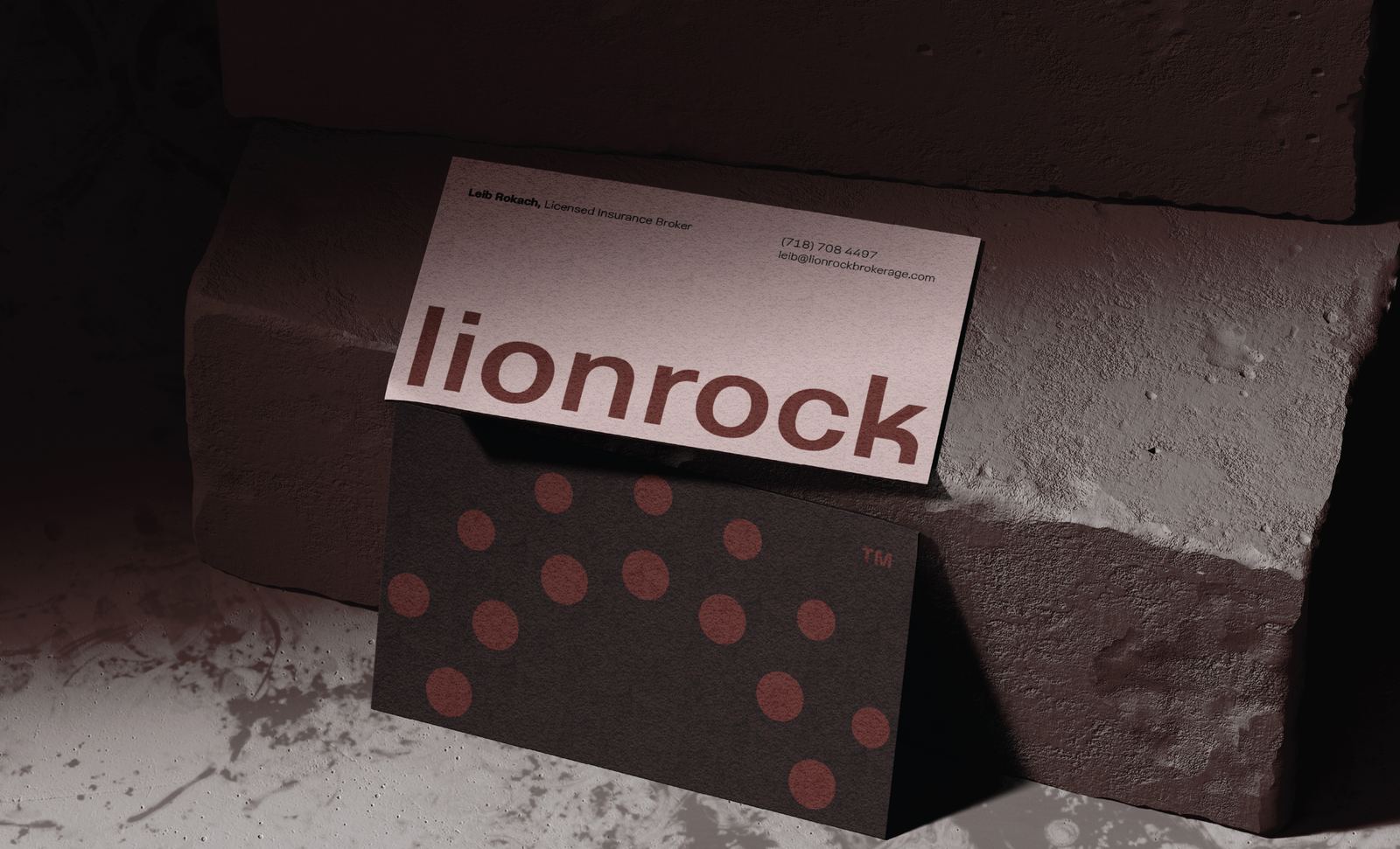
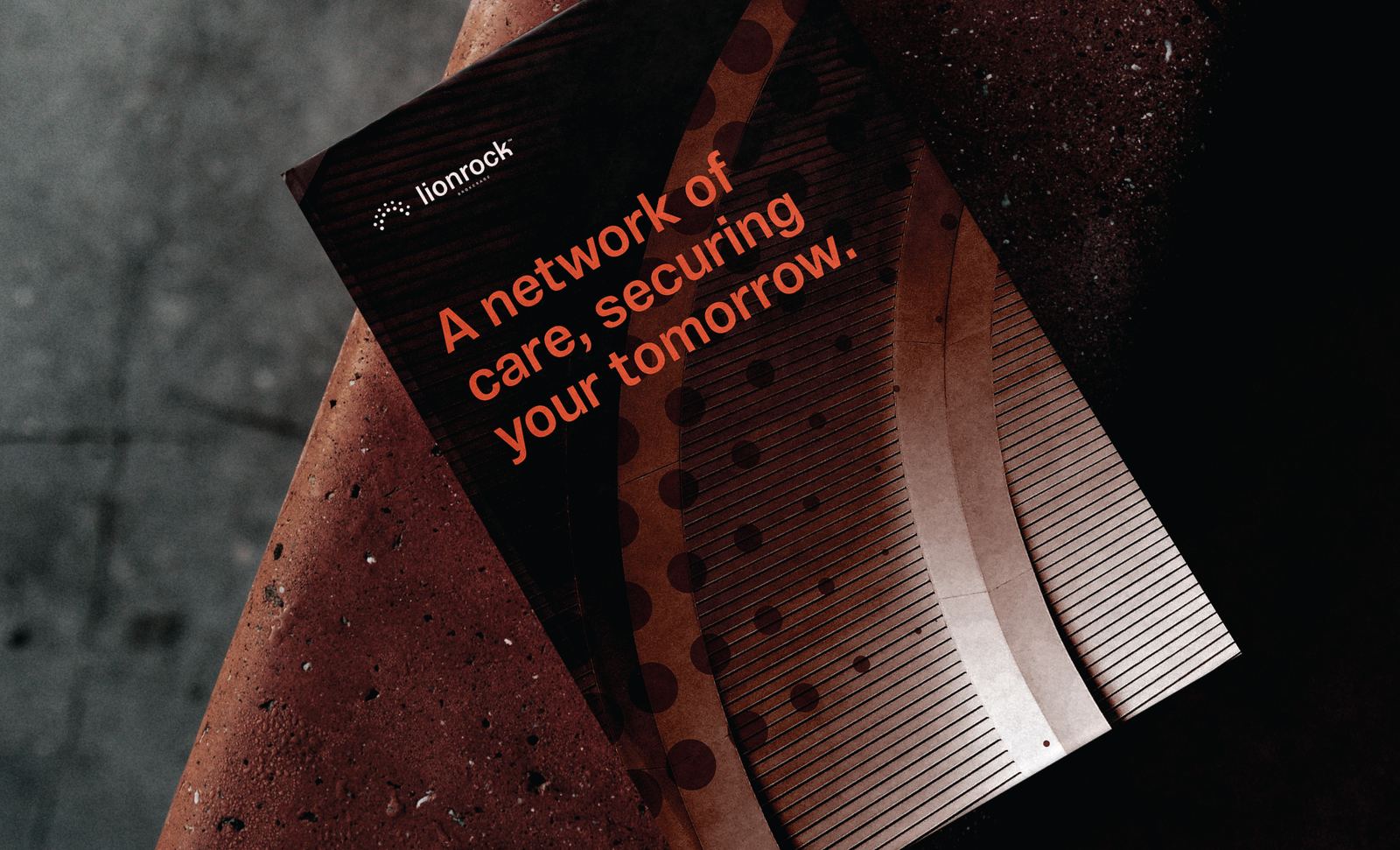
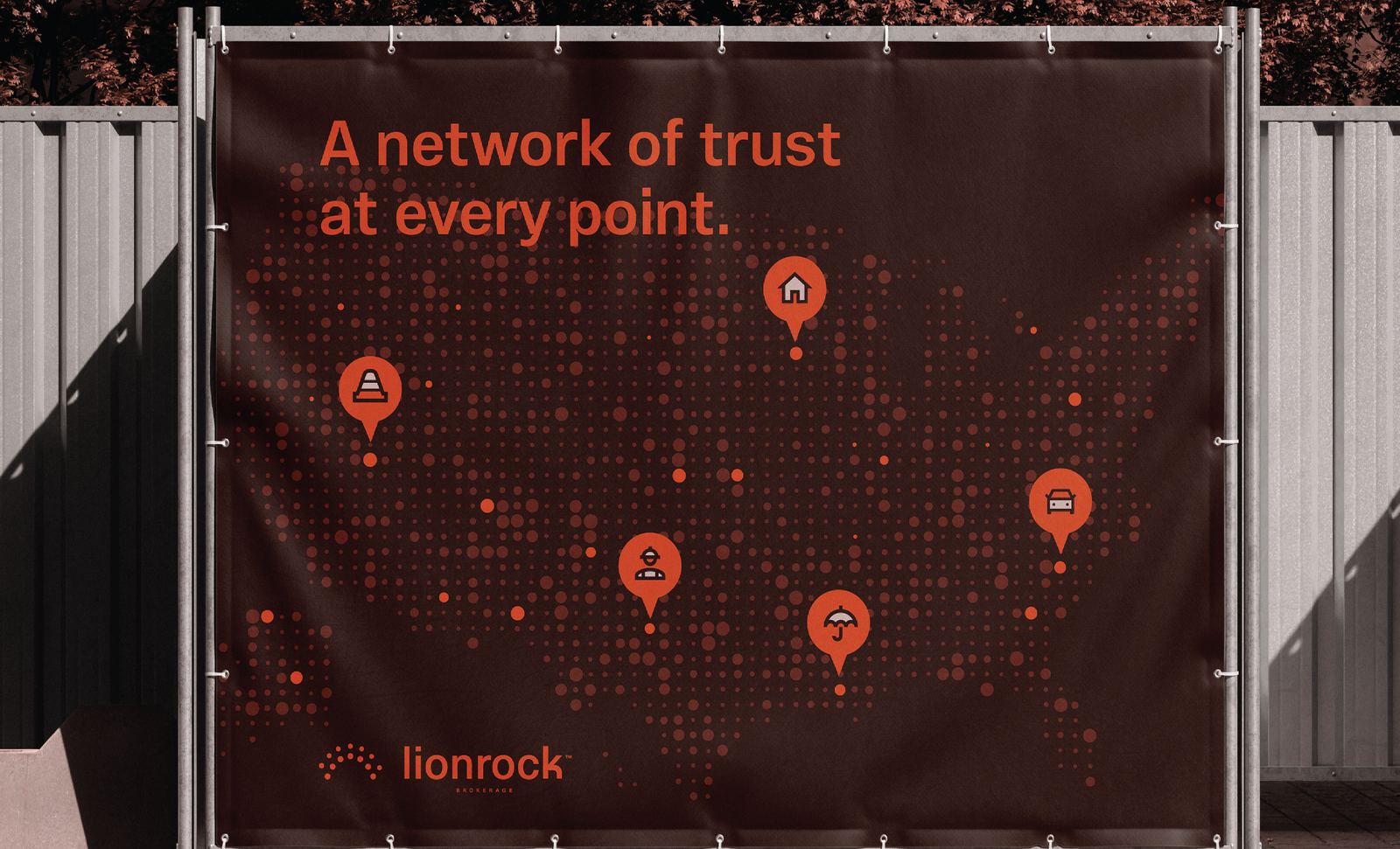
Lionrock Brokerage needed an identity that felt dependable without feeling traditional. The brand was designed to communicate protection, transparency, and lasting relationships through a modern visual system that reflects both the strength of its network and the confidence it provides every client.

Behind the mark
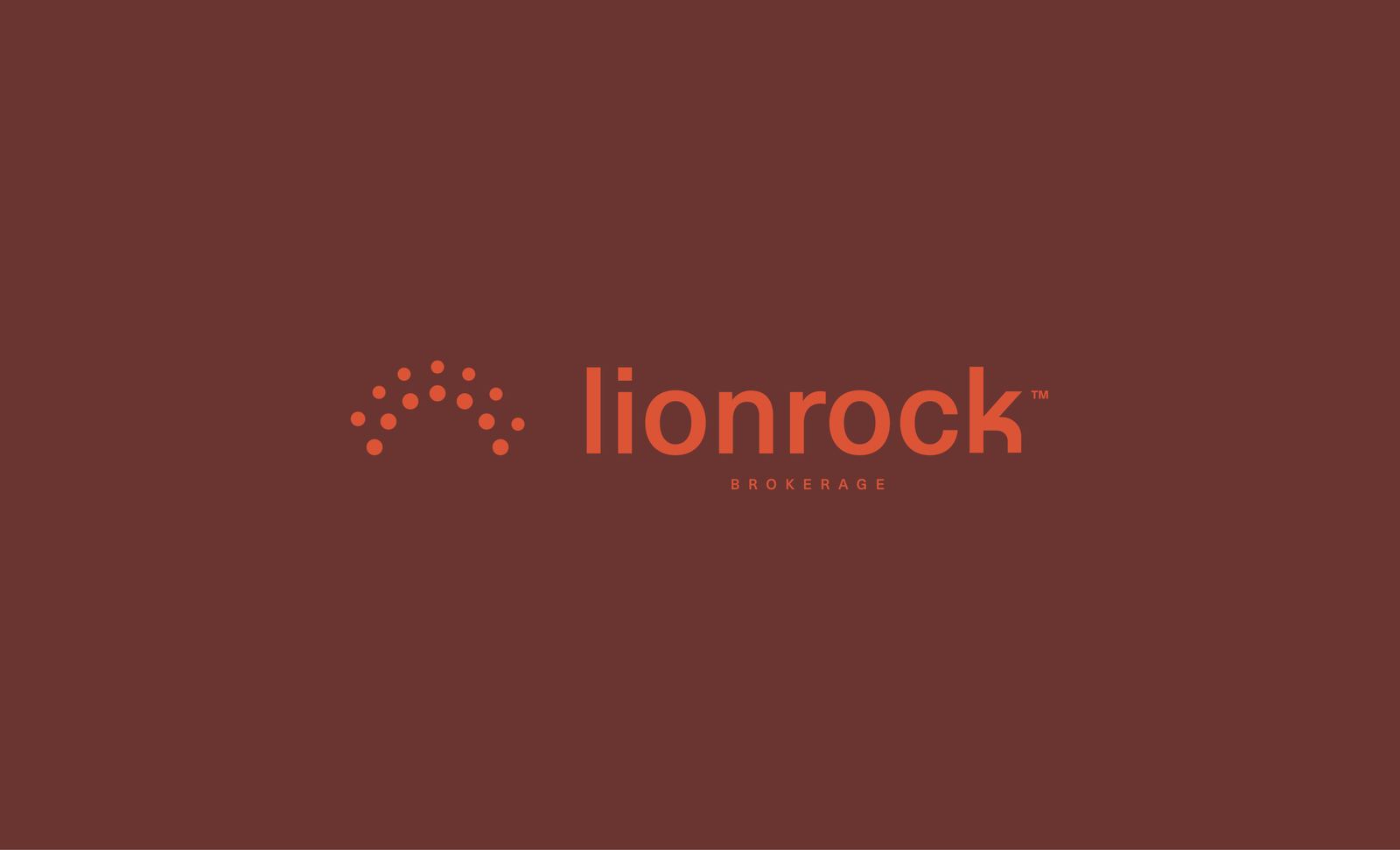
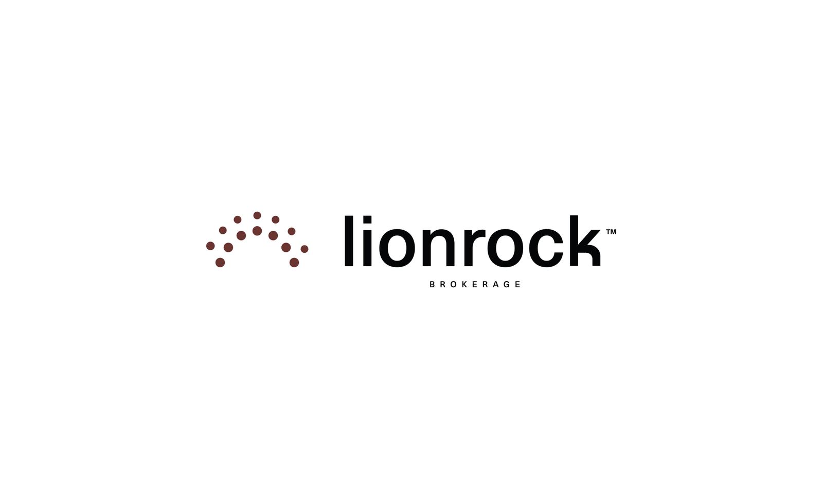
The icon is built from a series of connected dots arranged into a protective arch. Together they represent Lionrock's network of support, with each point contributing to a stronger whole. The upward curve symbolizes security, stability, and forward progress, while the open construction keeps the identity approachable, transparent, and distinctly modern.
Color palette 1
Next projects