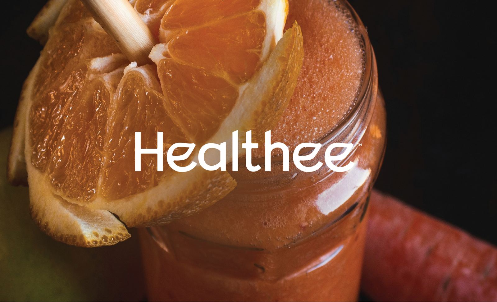
Giving everyday wellness a warmer identity.
The brief
Healthee needed an identity that felt fresh, welcoming, and grounded. The challenge was to move away from the overly clinical language often associated with health brands and instead create something that felt natural, approachable, and easy to connect with.
Behind the mark
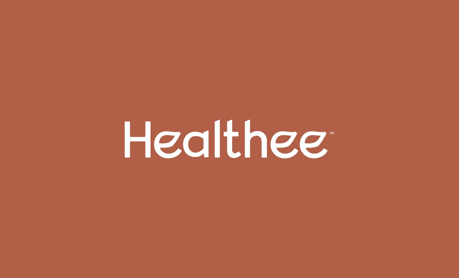
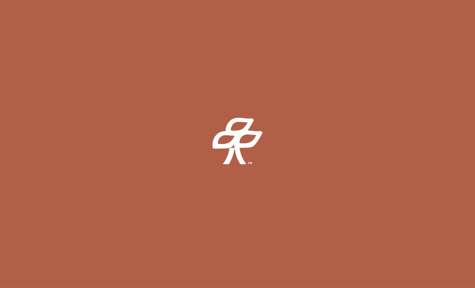
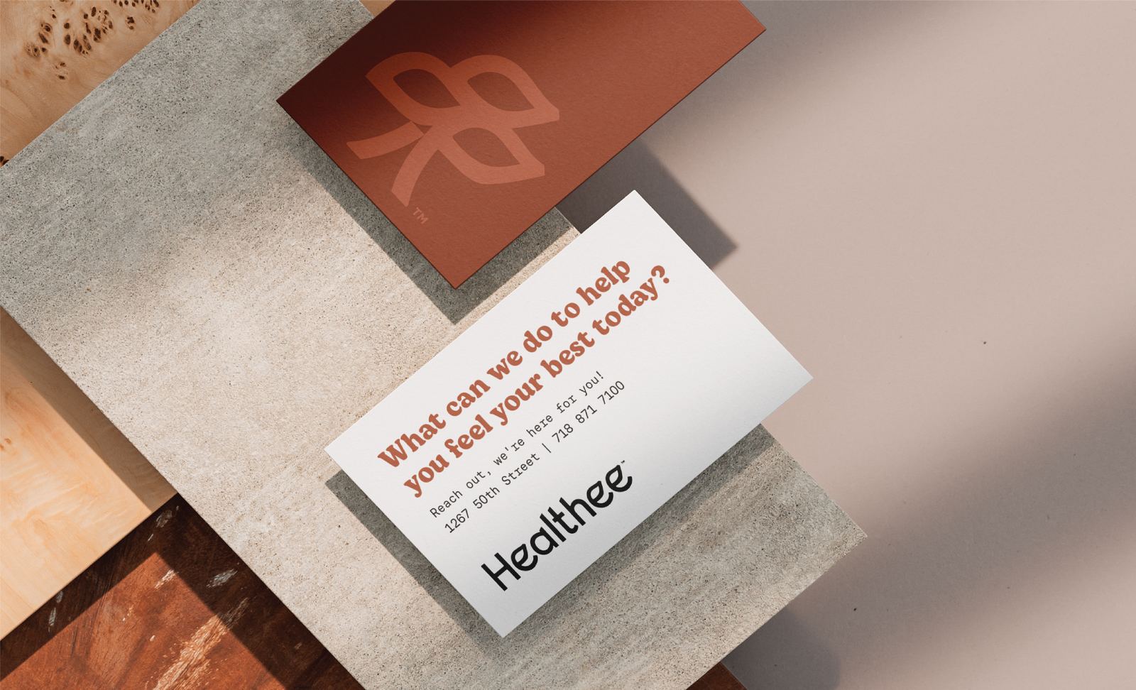
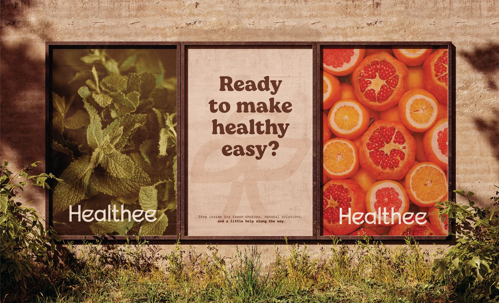
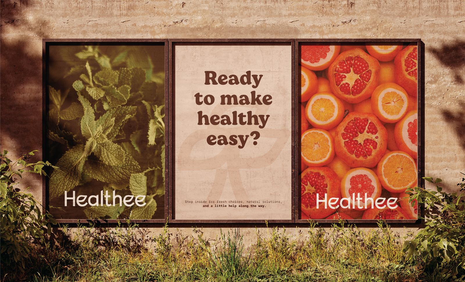
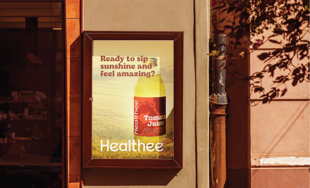
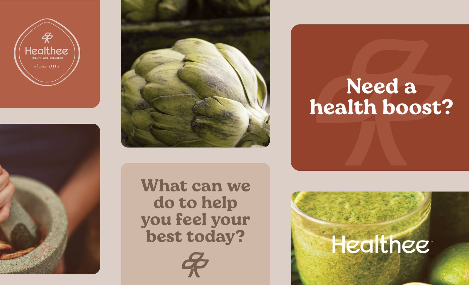
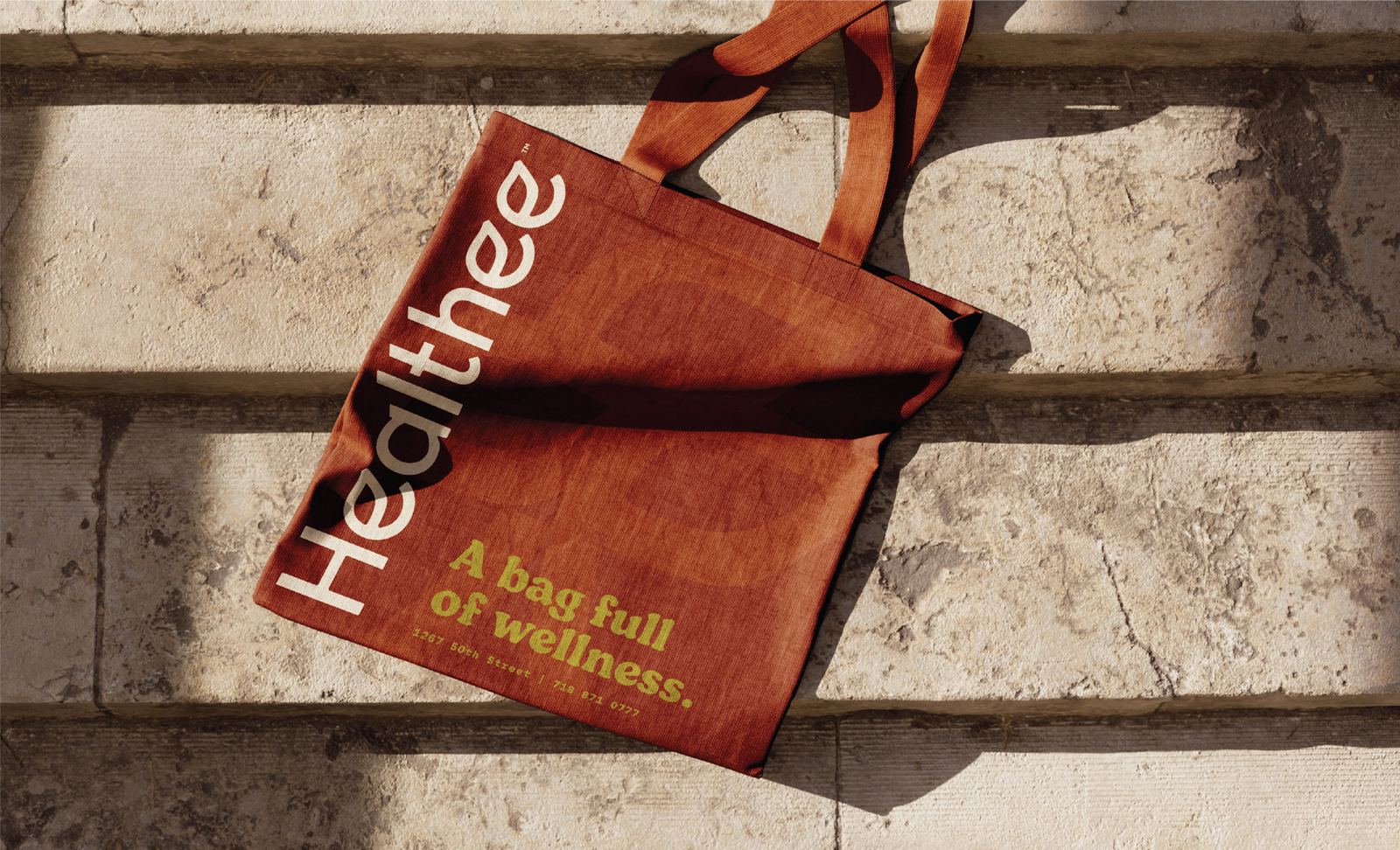
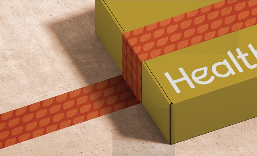
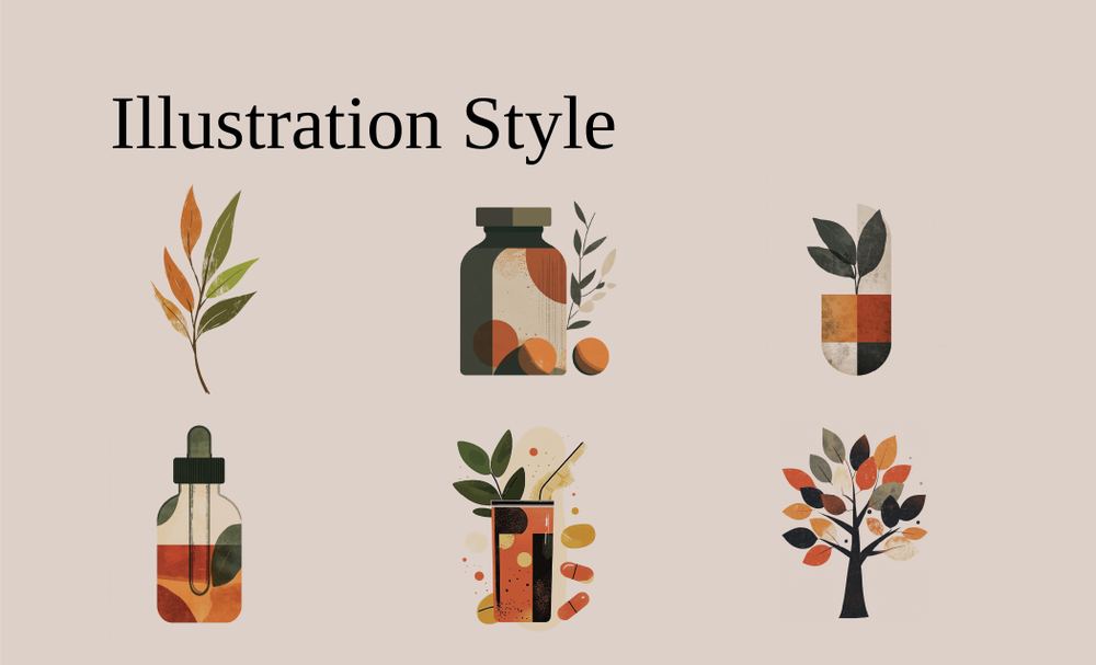
The identity combines clean typography with subtle organic details inspired by nature. A leaf integrated into the custom lettering becomes the foundation for a standalone tree icon, creating a visual system that represents growth, vitality, and wellness while remaining simple enough to live across packaging, signage, and digital experiences.

Color palette 1
Next projects