Creating marketing without one-size-fits-all thinking.
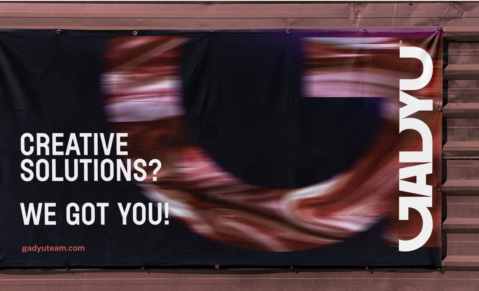
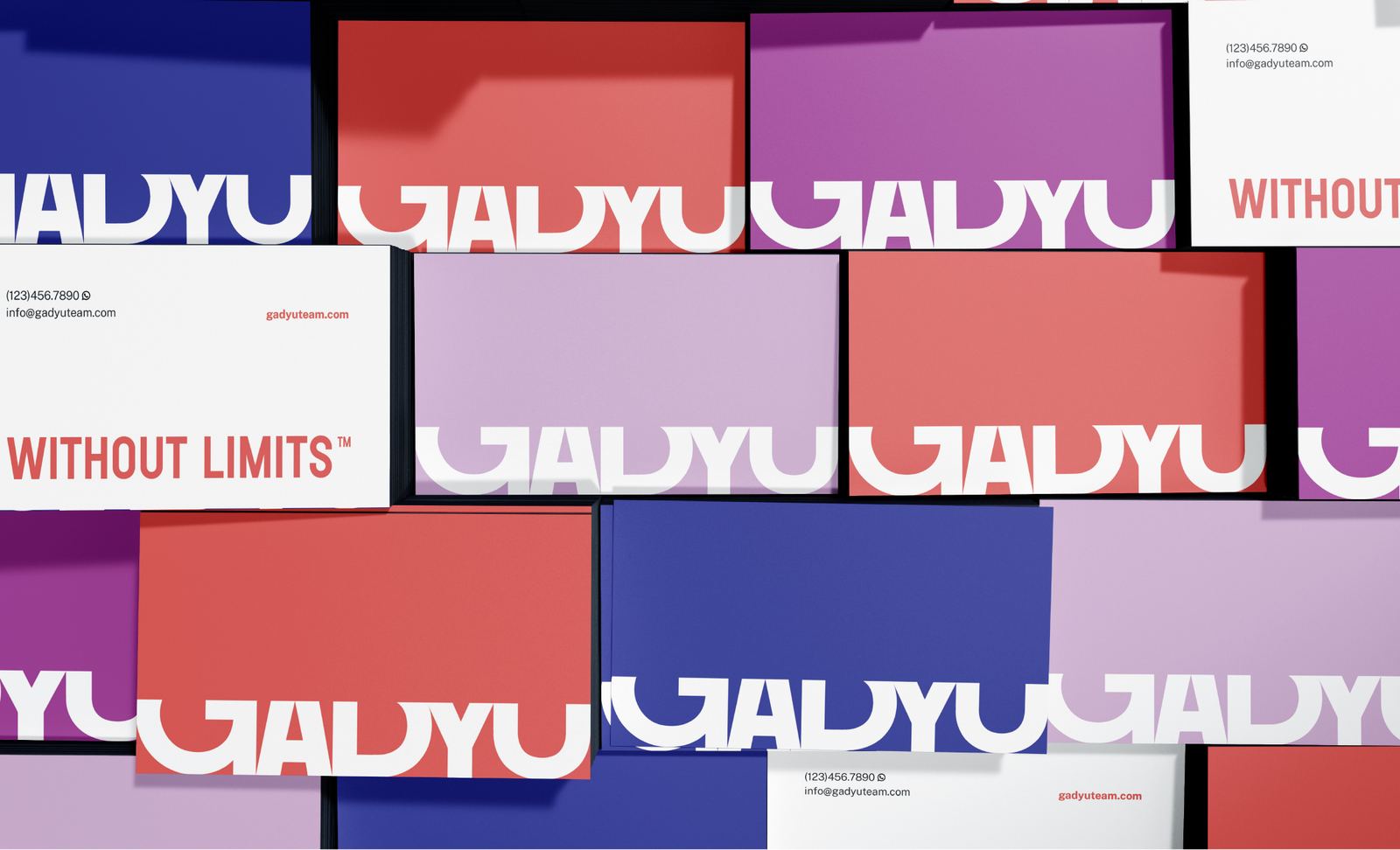
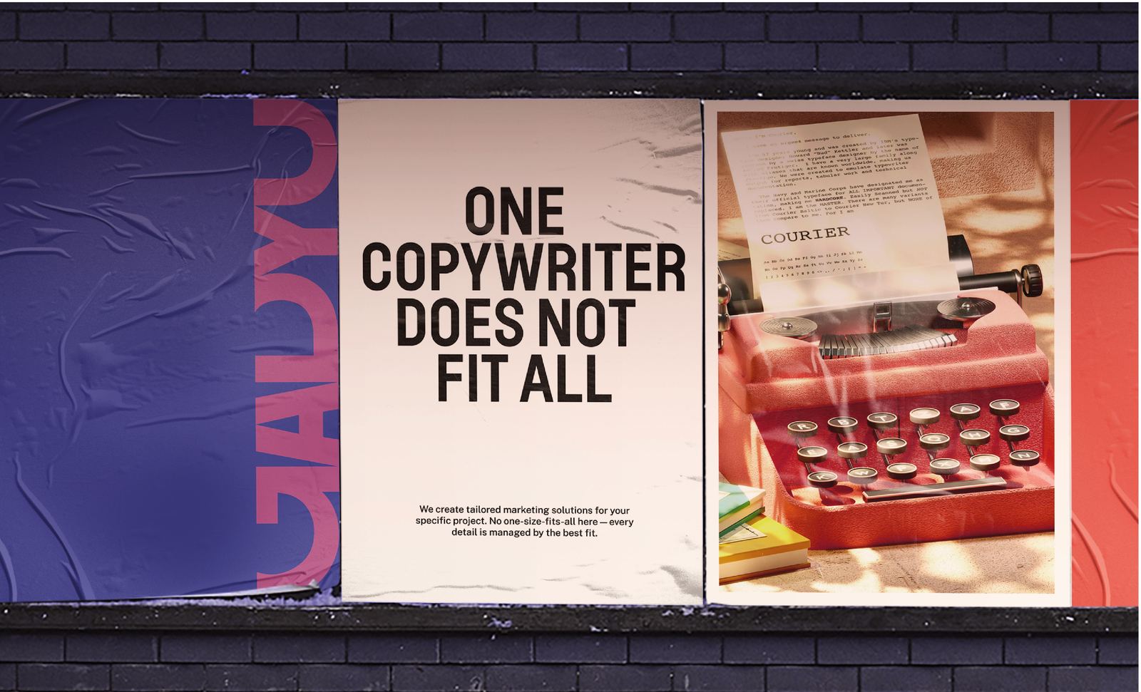
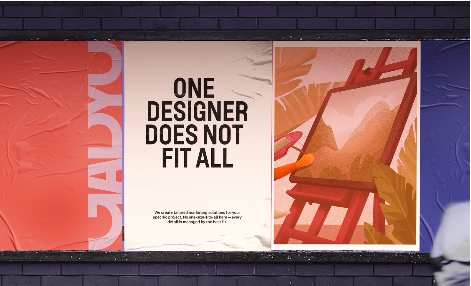
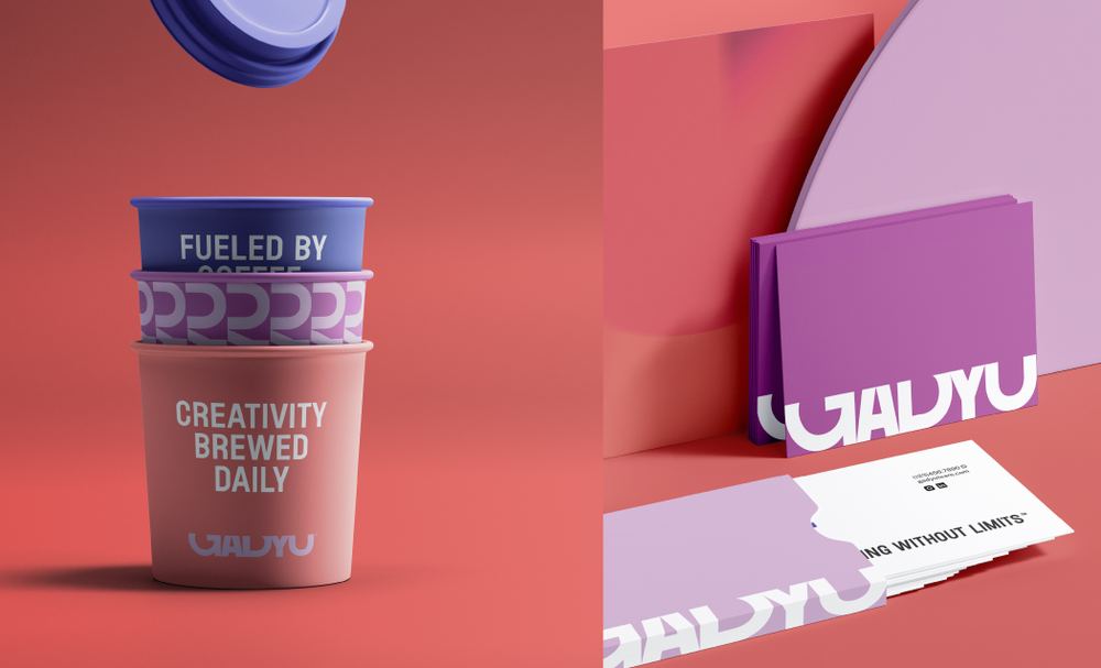
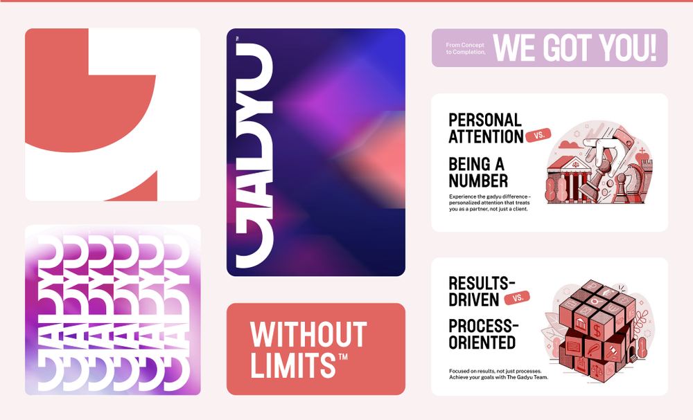
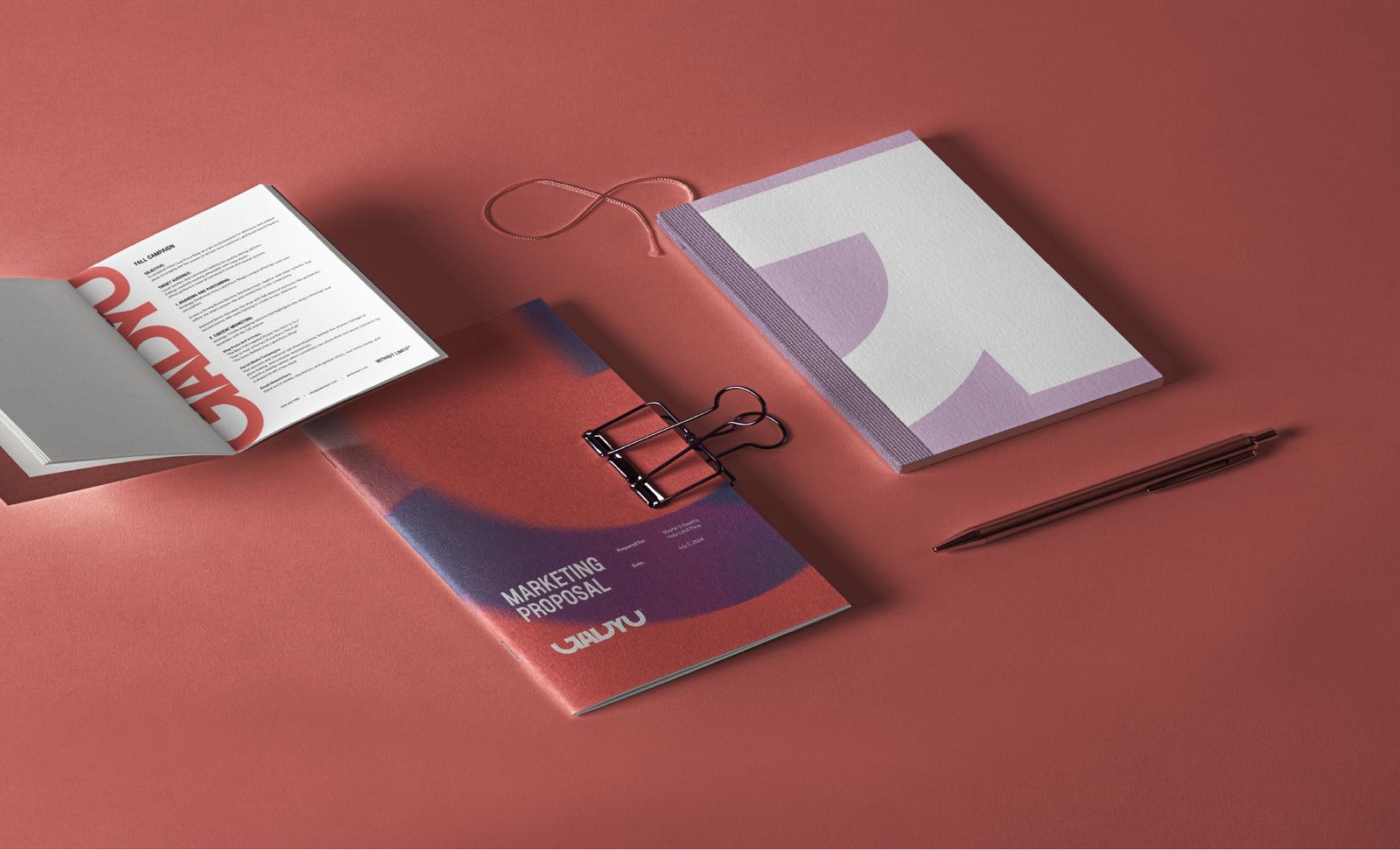
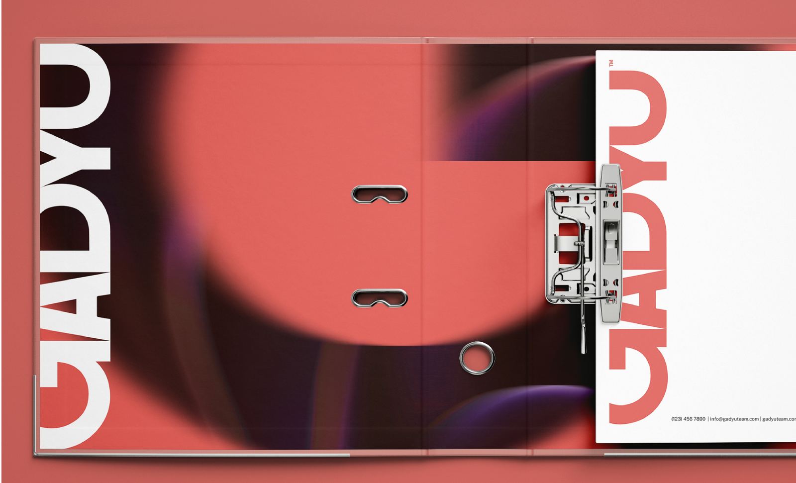
Gadyu Team rejects the one-size-fits-all agency model. Instead of assigning every client the same process, it assembles the right specialists for every project. The identity was designed to reflect that flexibility through a bold visual system that feels dynamic, collaborative, and built around limitless creative possibilities.
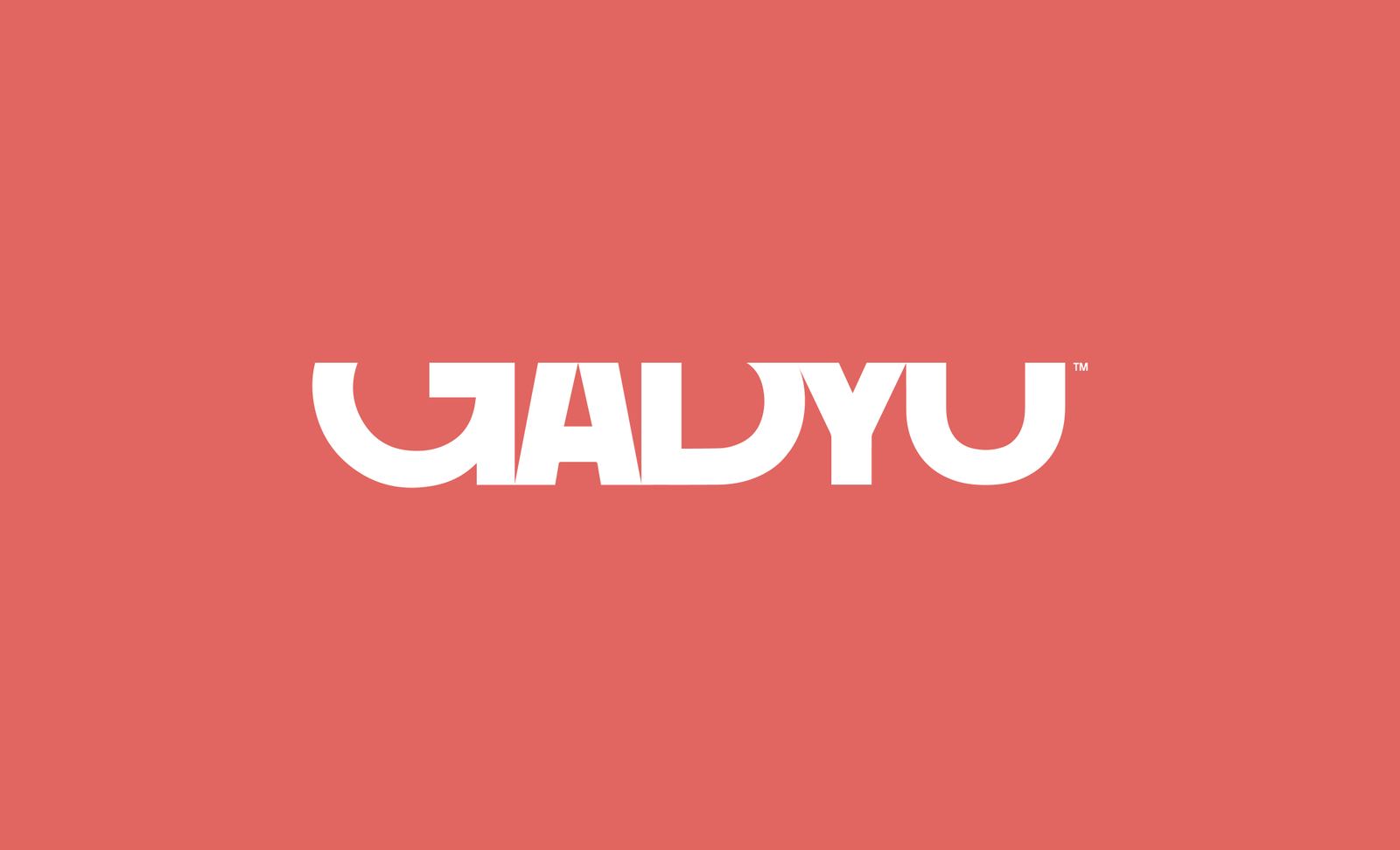
The custom wordmark is built from stretched, varied letterforms that communicate adaptability and limitless creative potential. The changing proportions reflect the team's ability to tailor every project to its unique needs, while the form subtly reveals a Hebrew gimel when viewed from the side, creating a hidden detail that gives the identity a distinctive personality without sacrificing clarity.