Giving luxury craftsmanship a refined identity.
The brief
A luxury kitchen brand deserves more than a luxury aesthetic. Brass & Oak needed an identity that reflected the craftsmanship, permanence, and quiet elegance behind every project, creating a visual language that feels as timeless as the spaces themselves.

Behind the mark
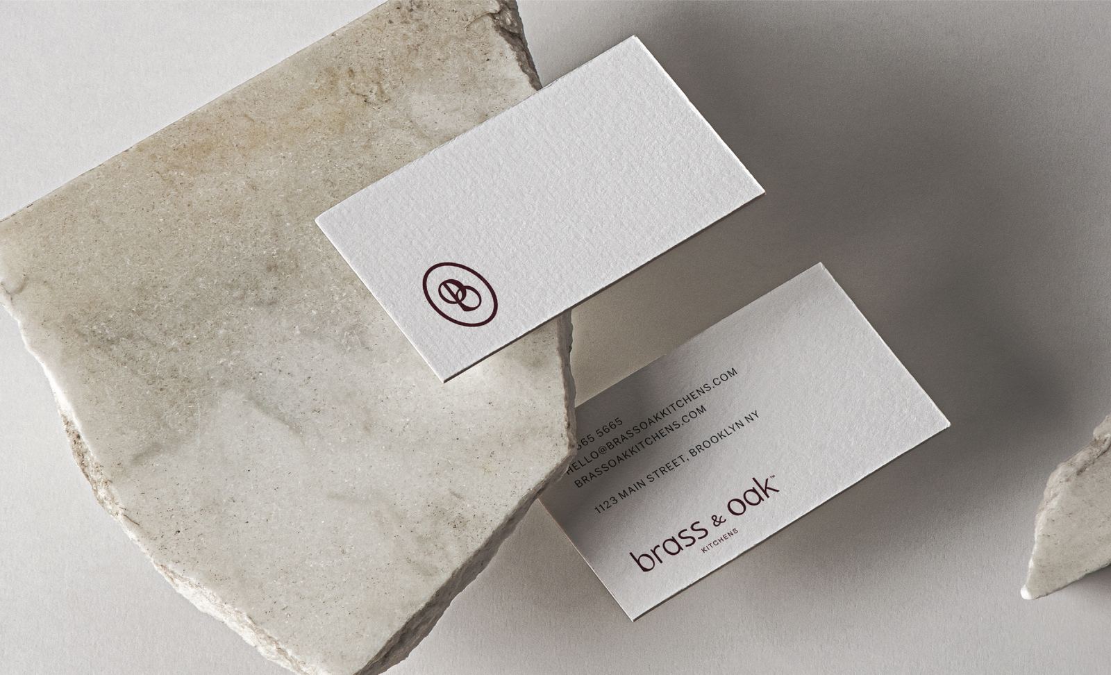
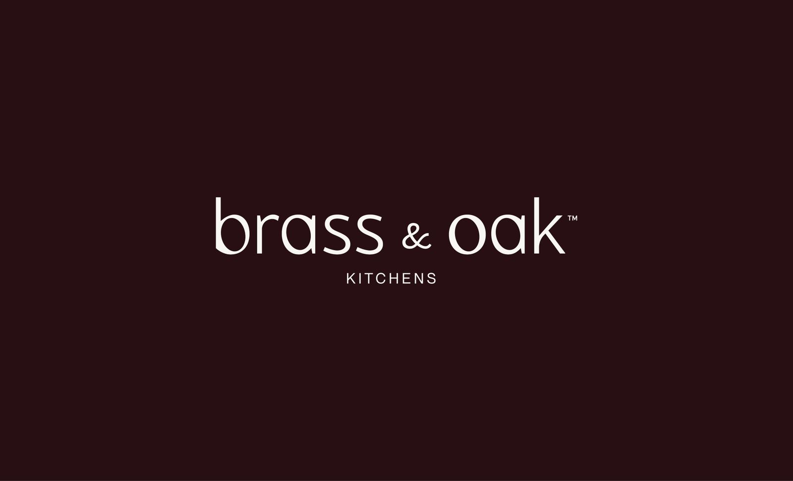
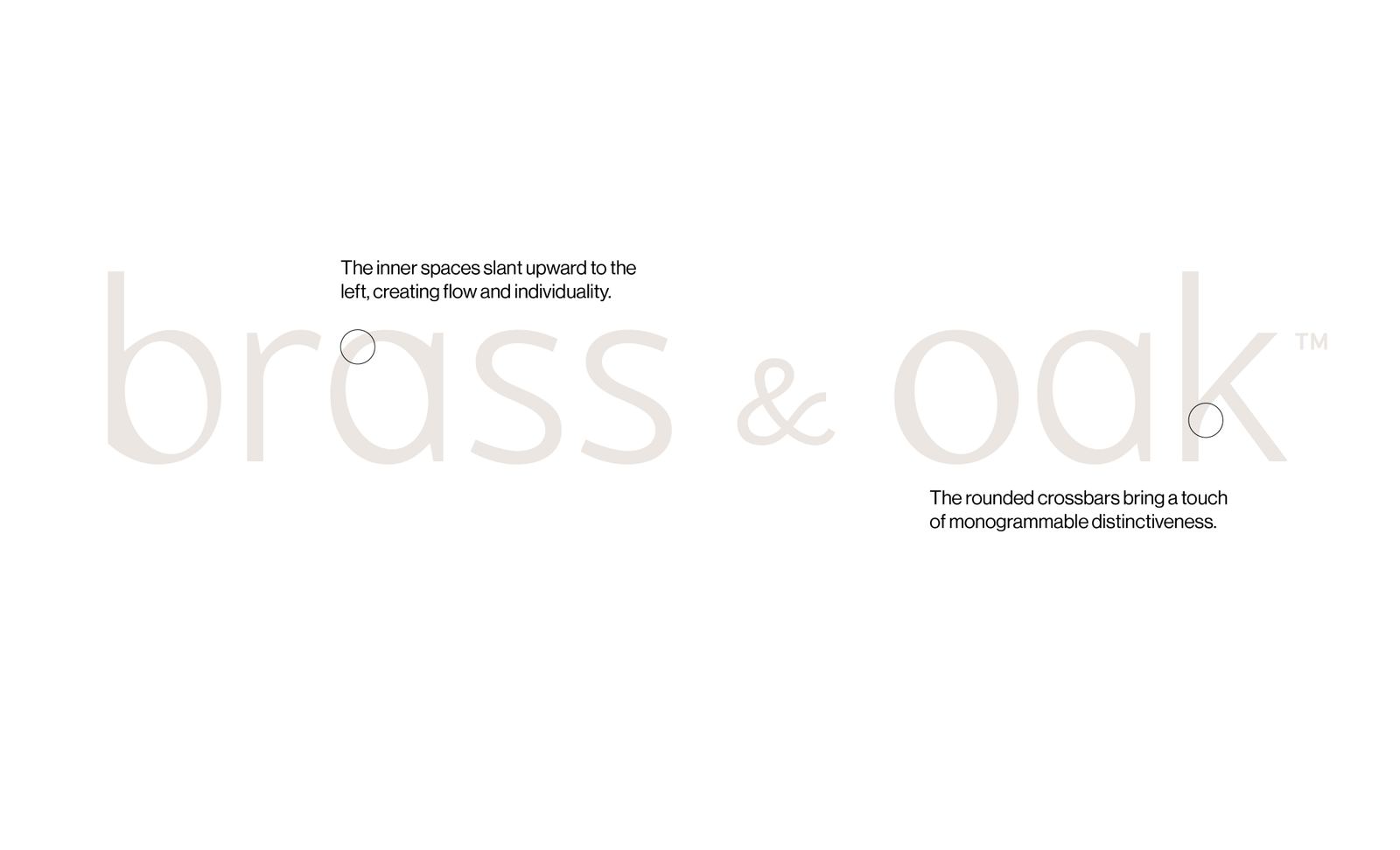
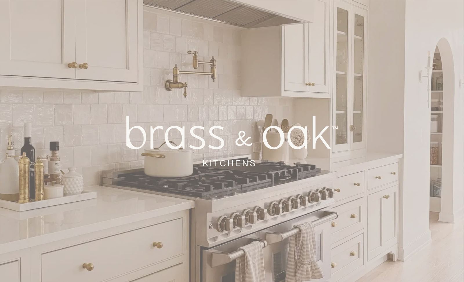
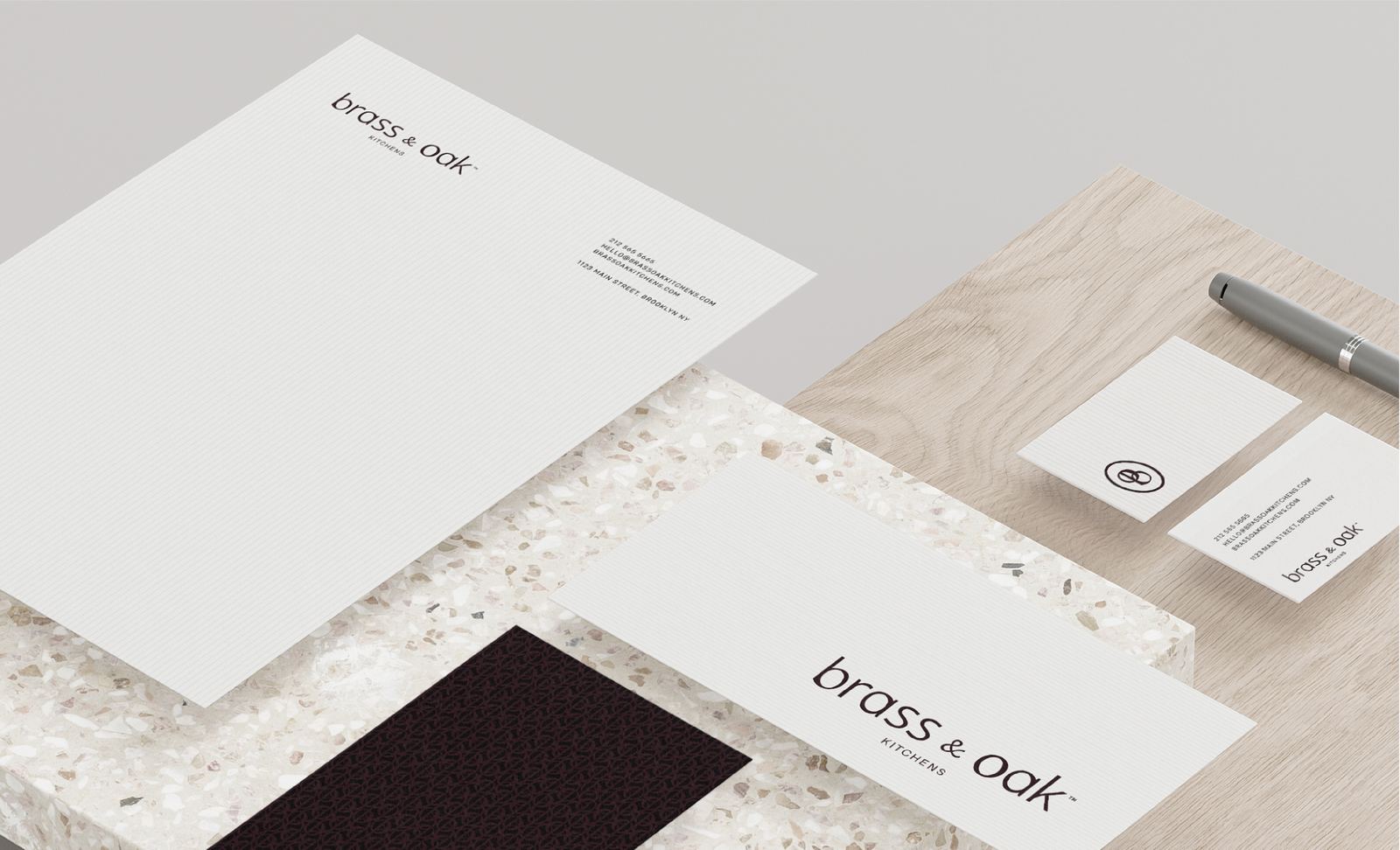
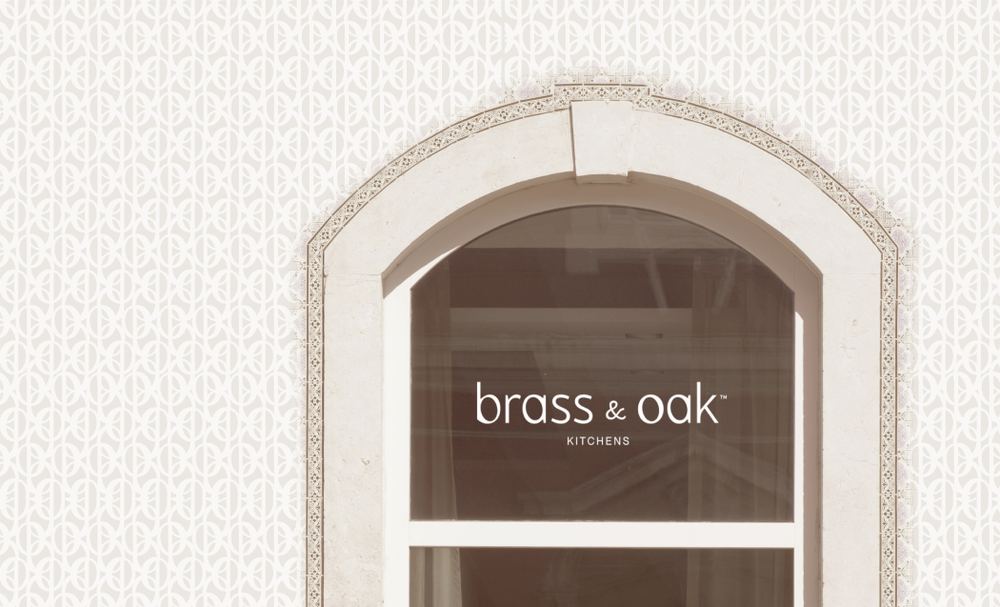
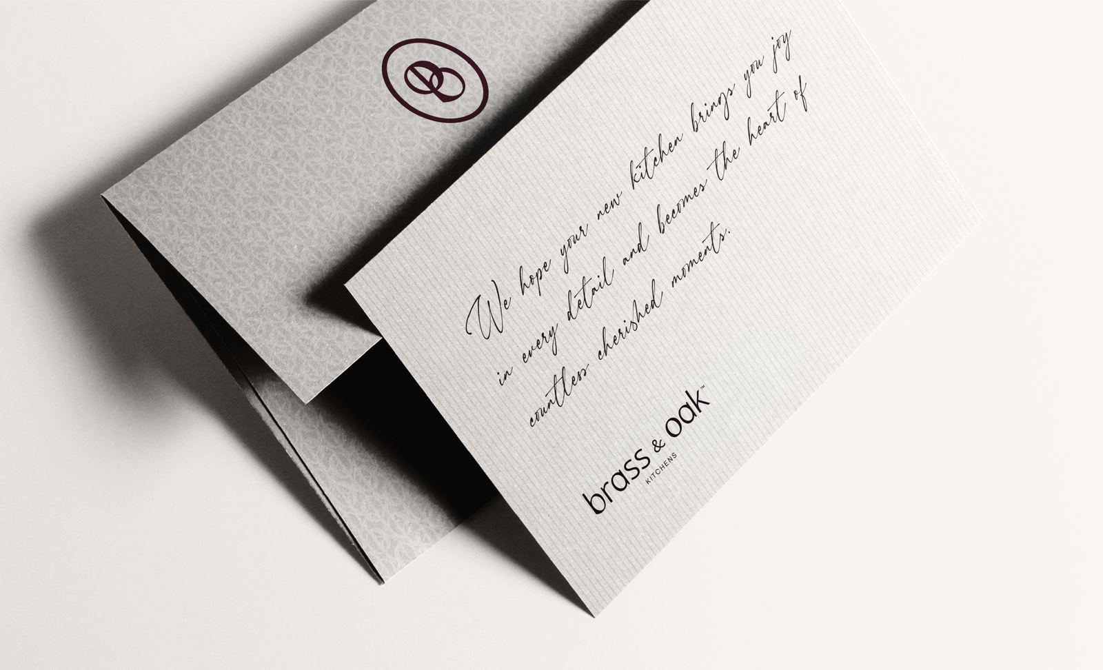
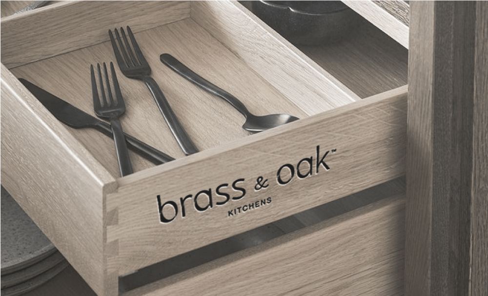
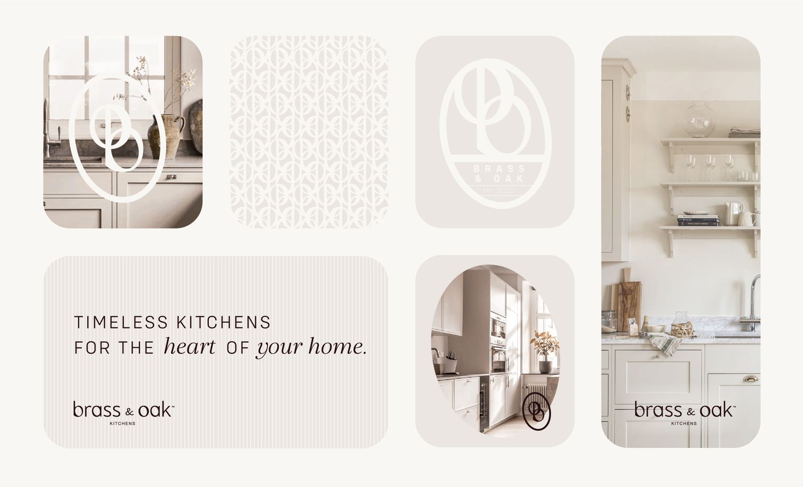
The custom wordmark is built from refined, understated letterforms with subtle details that give the identity its character. Soft curves, distinctive crossbars, and carefully balanced proportions create a mark that feels elegant without excess. Paired with an interlocking monogram, the identity reflects the craftsmanship and lasting quality at the heart of the brand.

Color palette 1
Next projects