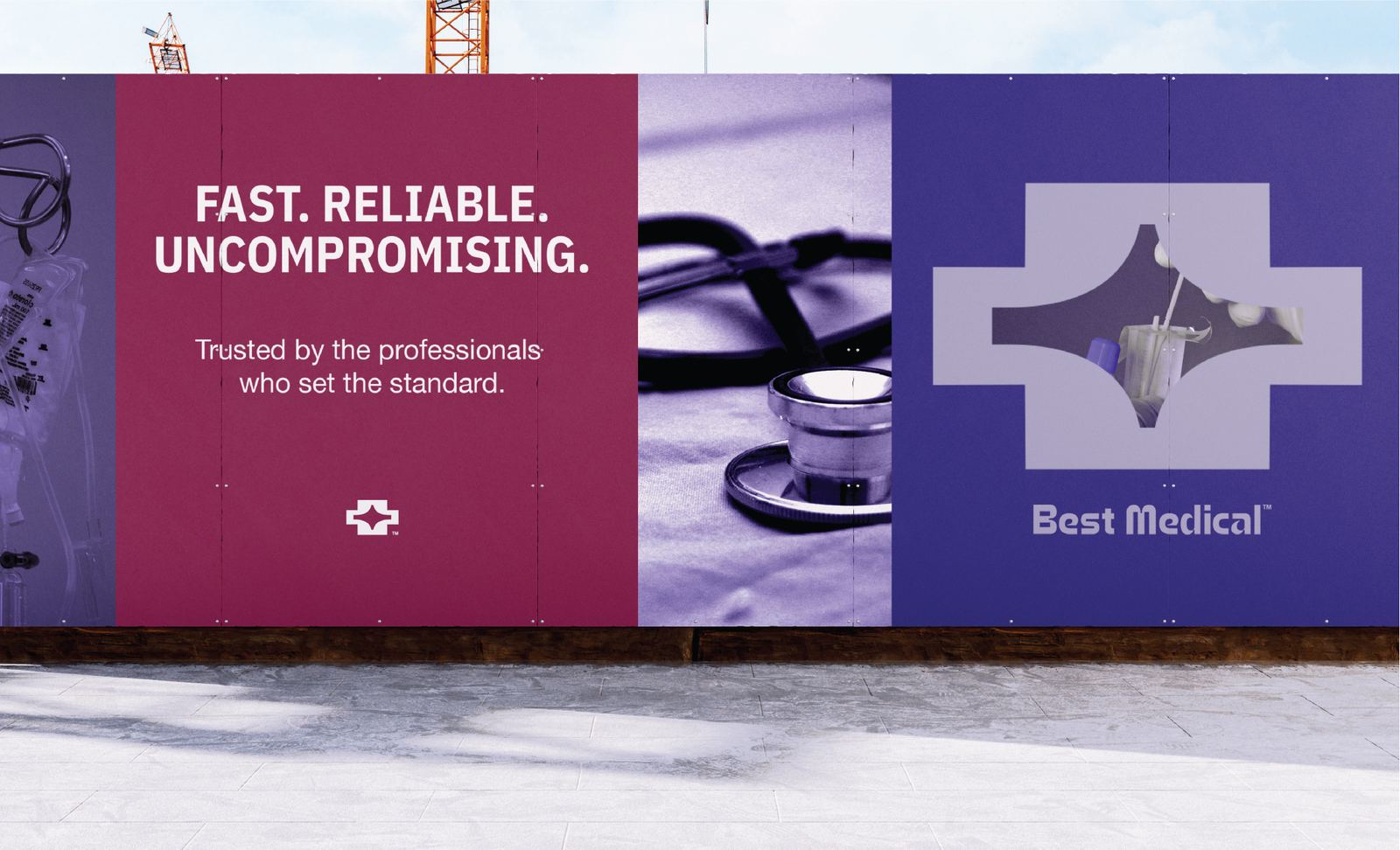
Supplying the professionals who set the standard.
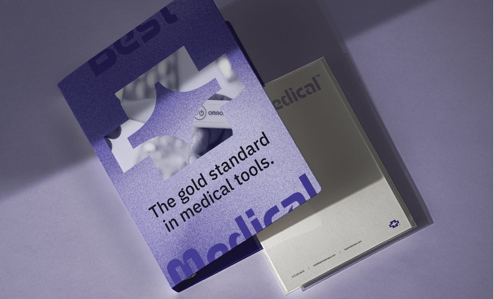
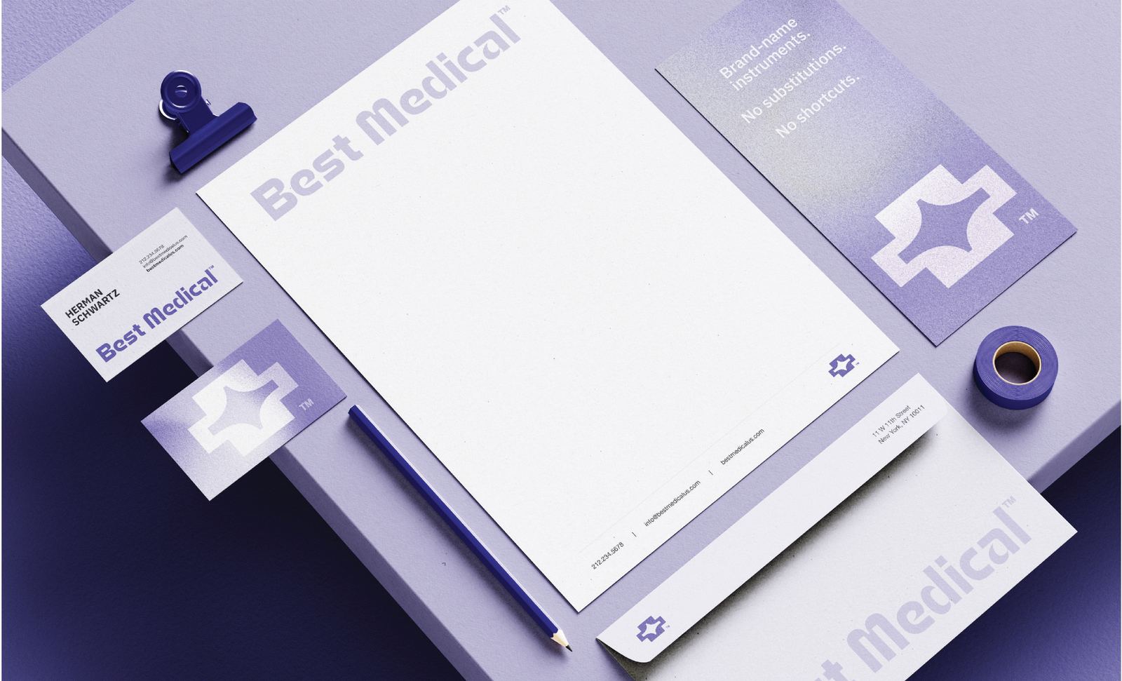
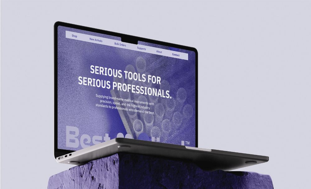
Best Medical supplies brand-name medical instruments to healthcare professionals who depend on precision every day. The identity was designed to reflect the same qualities found in the products themselves: accuracy, reliability, and uncompromising performance. Through a bold visual system and distinctive typography, the brand positions itself as a trusted supplier for professionals who demand the best.
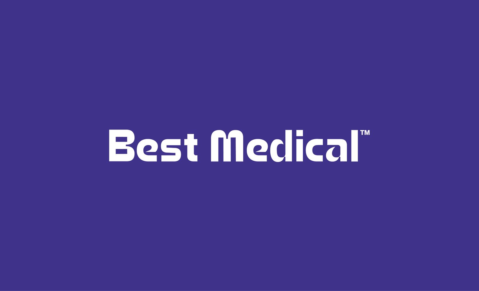




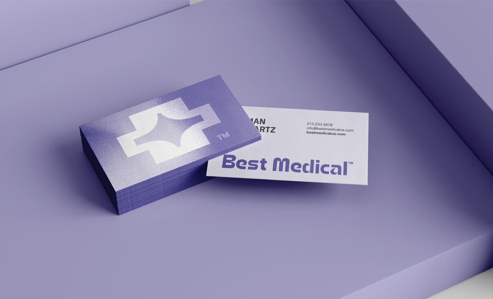
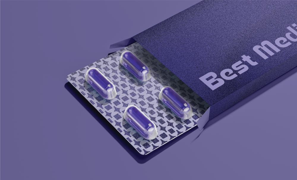
The identity combines a custom wordmark with a modern interpretation of the medical cross. Bold geometry and softened curves create a balance between precision and approachability, while the star-shaped negative space symbolizes excellence, guidance, and innovation. Shared curves and proportions between the icon and wordmark create a unified visual language, resulting in a brand that feels confident, recognizable, and built to last.