Building trust into every property transaction.
The brief
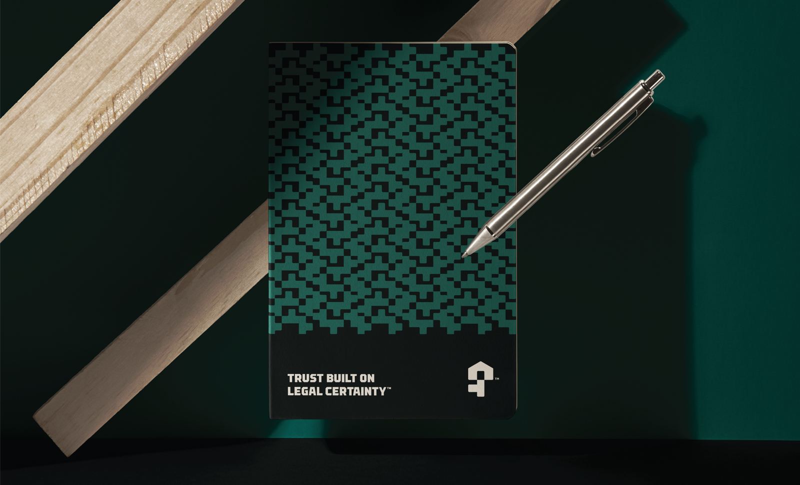
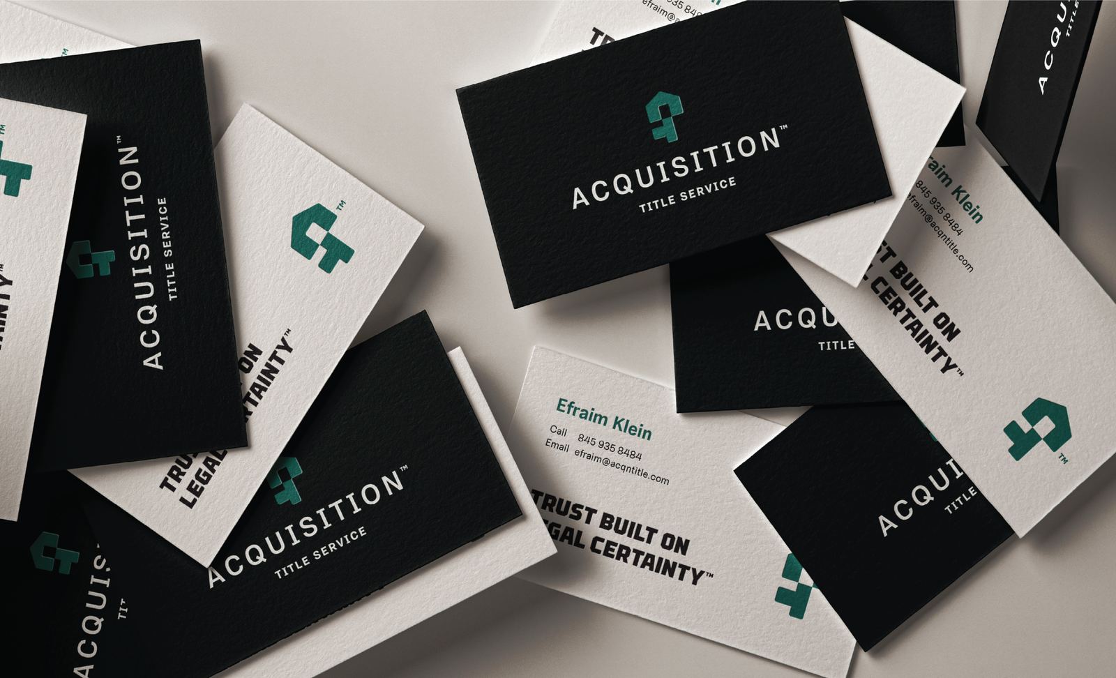
Acquisition Title Service simplifies the legal complexities behind property transactions. The identity was designed to communicate confidence, professionalism, and reliability through a clean visual system that reflects the precision and trust every successful closing depends on.



Behind the mark
The symbol combines two familiar forms into a single, memorable icon: a key, representing security and access, and a house, directly connecting the mark to property ownership. Its minimalist construction reinforces the brand's efficient, modern approach, communicating confidence without unnecessary complexity.







Color palette 1
Next projects